Asteroid Plunge
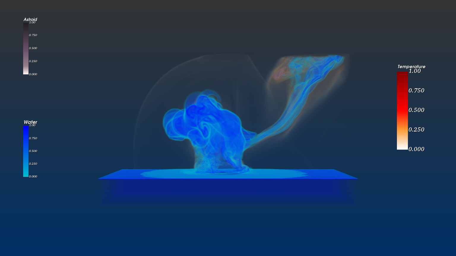
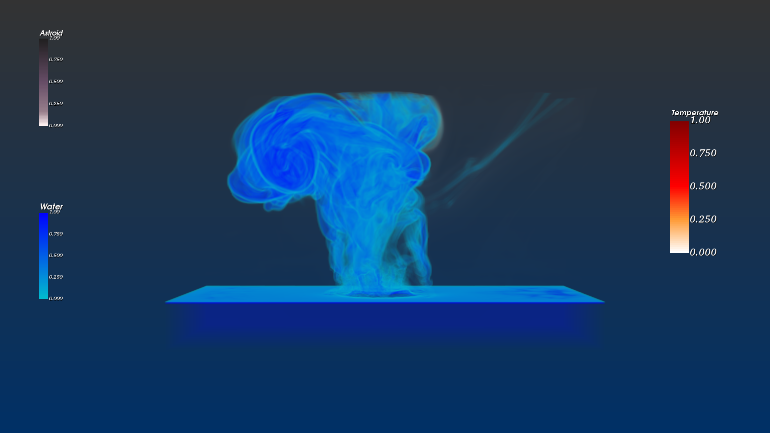
A volume-rendered visualization of a 250m asteroid striking water, built from a 132 GB scientific simulation dataset.
132 GB of asteroid impact simulation.
The source data is from LANL's Deep Water Asteroid Impact ensemble — a hydrodynamic simulation of an asteroid striking a body of water at various entry angles, sizes, and airburst conditions. I worked with two scenarios: yB31 (with airburst) and yA31 (without), both modeling a 250-meter asteroid entering at 45 degrees. Combined size: 132 GB. Each frame: a 300³ voxel grid carrying eleven scalar fields — density, pressure, temperature, three velocity components, sound speed, AMR refinement level, material ID, and volume fractions for water and asteroid.
The download alone took eight hours. The harder problem was rendering it.
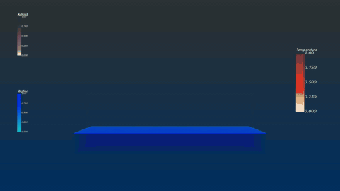
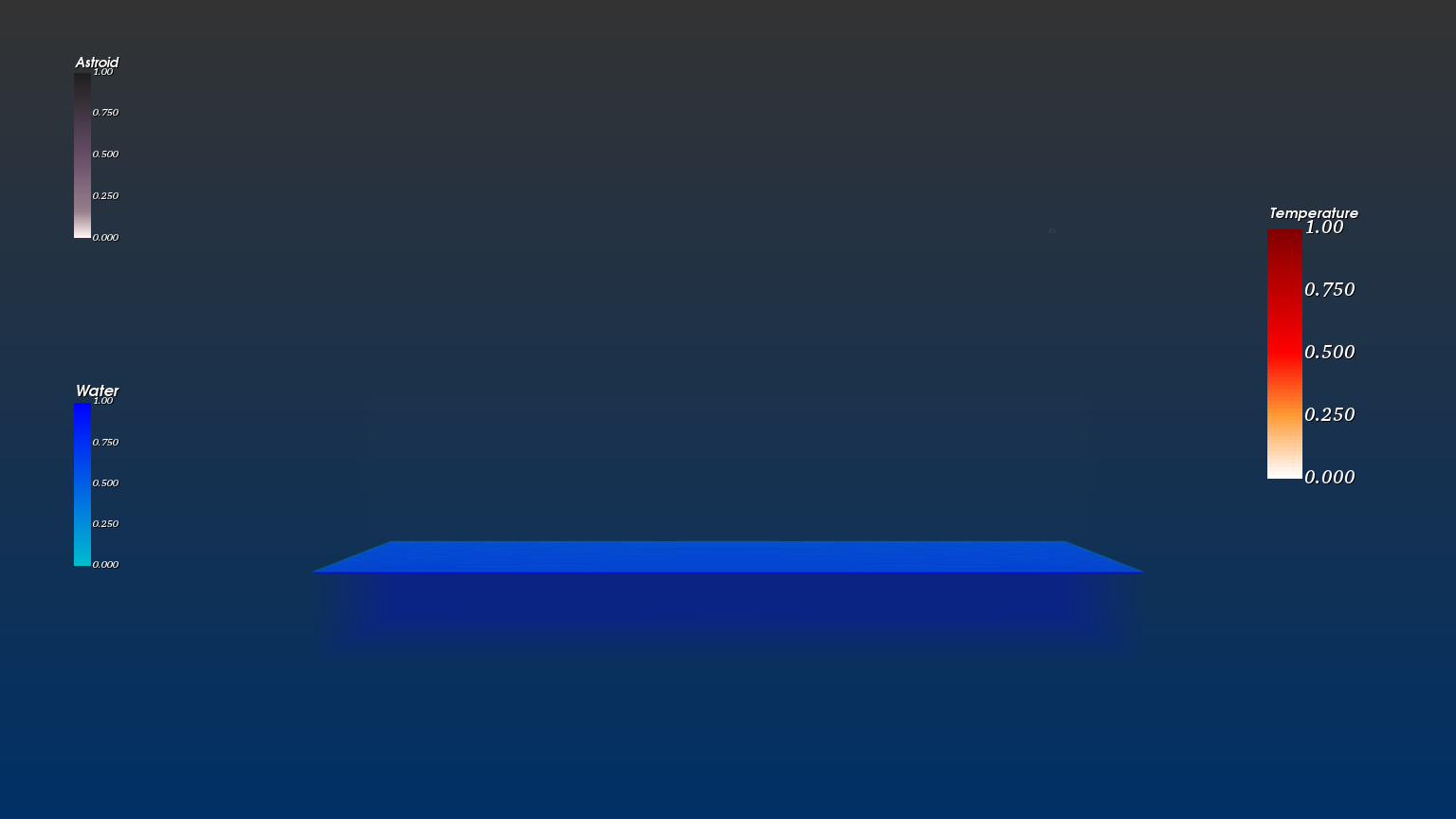
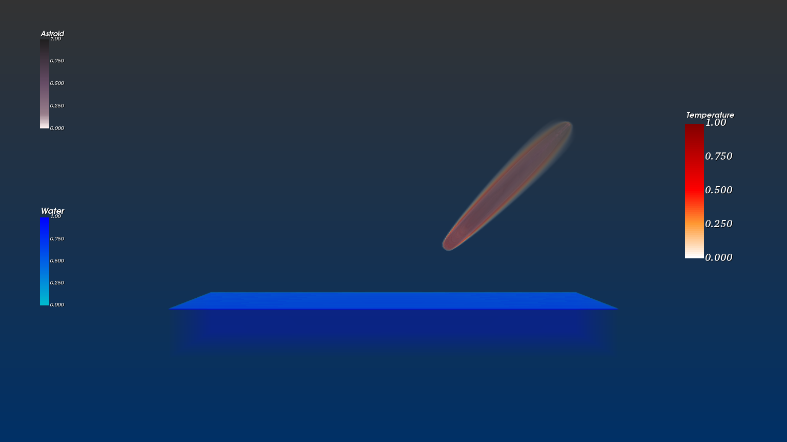
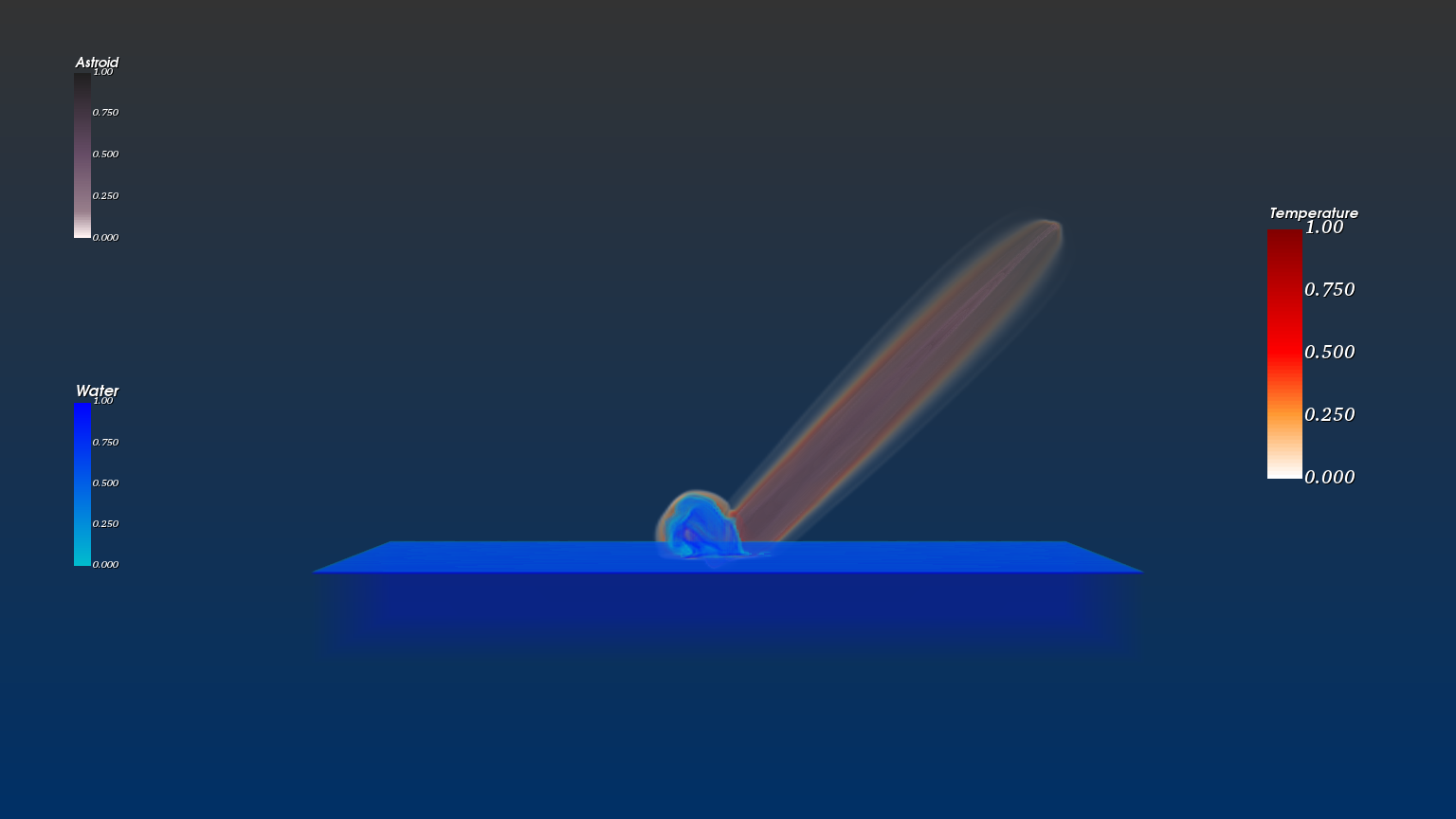
Three composed volumes, layered into a single scene.
I read the VTI files through VTK's XMLImageData reader and converted them into structured points. Each scalar field I wanted to visualize — water, asteroid, and temperature — got its own volume mapper, opacity transfer function, and color transfer function. The three were composed into a single scene with separate actors, each tuned independently.
The visual language is intentional: water in blue, asteroid in monochrome (its mass blending into the atmosphere as it descends), temperature in white-to-red where the heat trail and impact energy concentrate. Reading all three together gives you a physical picture of the event without needing to label what's what.
From calm to cataclysm.
Five moments from the sequence:
Where the engineering was.
-
Pressure rendering hit the OpenGL ceiling.I originally wanted four volumes — water, asteroid, temperature, and pressure. Pressure rendering kept blowing through GPU memory limits and clashing with VTK's GPU raycaster. Switching the volume rendering function didn't resolve the OpenGL error. The realization that saved the visualization: pressure is implicit in the other variables. Where temperature spikes and water displaces, pressure is doing work. Like seeing wind through what it moves — you don't have to render the wind. I dropped pressure as an explicit channel and the visualization read more clearly without it.
-
A thin opacity layer was hiding the impact.The water volume kept showing a thin sheet right at sea level that occluded the actual impact — you'd see only the water rising above it, never the moment of contact. I added a gradient opacity function on top of the scalar opacity to suppress the artifact. Knowing when to reach for gradient opacity vs. scalar opacity was the most useful thing I took from the project.
-
132 GB of data on a single workstation.The dataset wouldn't fit comfortably anywhere. Iterating on opacity and color maps required loading and reloading large volumes; each parameter sweep cost real wall time. I picked the 300³ "four-scalar" variant deliberately over the 1000³ all-scalar version — the lower resolution let me iterate on rendering decisions in minutes instead of hours, then commit to the visual language before scaling up.
The same instinct that drove this project — representing several physical fields at once, balancing opacity and color so the eye reads the simulation correctly — is the instinct I lean on now in production graphics work. The patent on prioritized rendering, the C++/Metal bridging at Miris, the SDK design for spatial streaming all trace back to the muscle this project built: knowing what to draw, at what fidelity, in what order, so a viewer perceives what matters.